Synch – (Updating)
Scope
Visual Identity
Web Design
3D Design
Art Direction
Synch is a fintech company empowering small businesses to reach new heights by connecting low lift capital solutions and lending expertise through ready to use software. Every owner needs a set of tools to help connect their business, that is what Synch is here to provide.
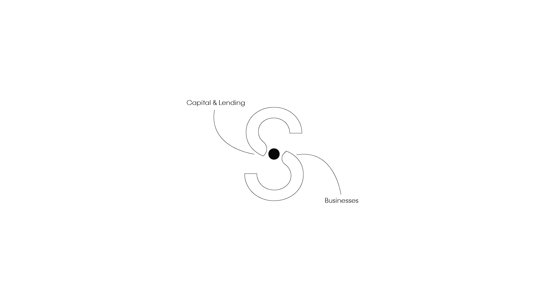
A concept formed based on connecting problems to solutions for owners and entrepreneurs - the design is meant to communicate ease of bringing both sides of the equation together to empower a business and owners.
Gaining Inspiration
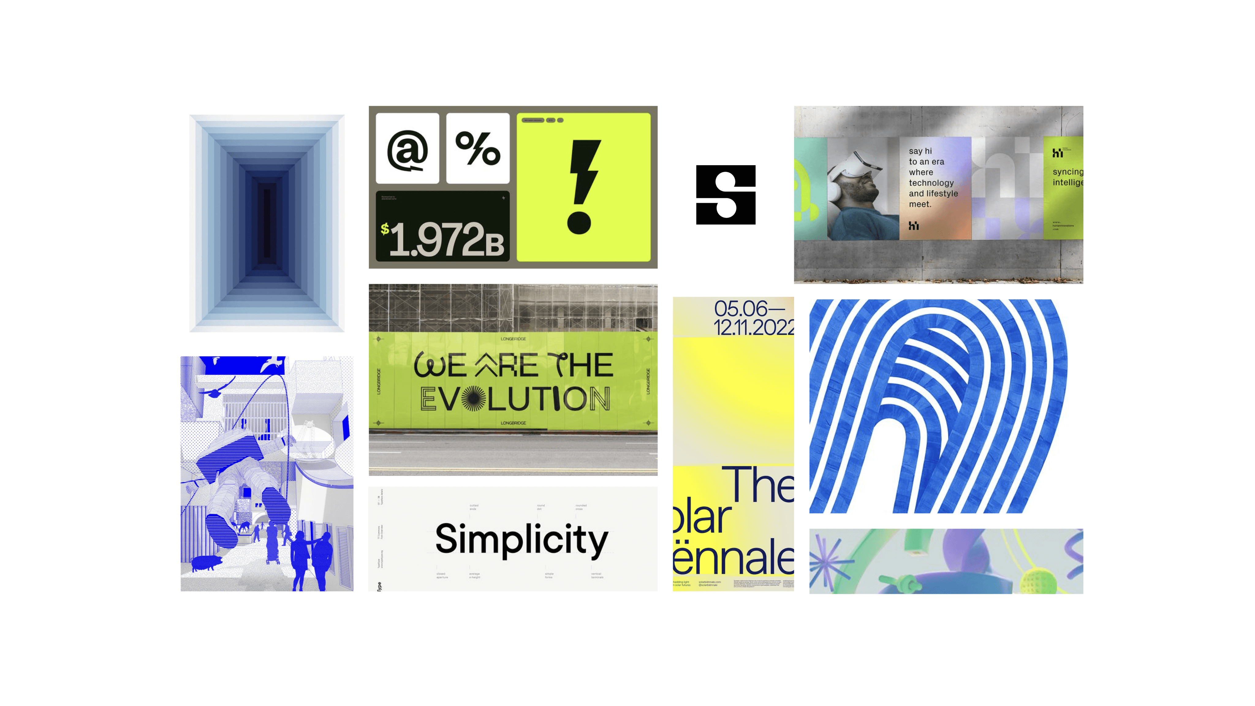
At the beginning of this project, I knew I wanted to find a certain mood that felt empowering and bold, but teetering between a slight playfulness while maintaining a professional idea. Thus, the moodboard is where this starts.
Since this project focuses around empowering business owners, I drew inspiration from some relatable companies that are using different colors, and some fun expressions in their brand. Bolt and Square were where I felt a lot of the same sort of feeling that resonated with this brand's goal of giving power to the users and making it feel like a true connection.
The Foundation
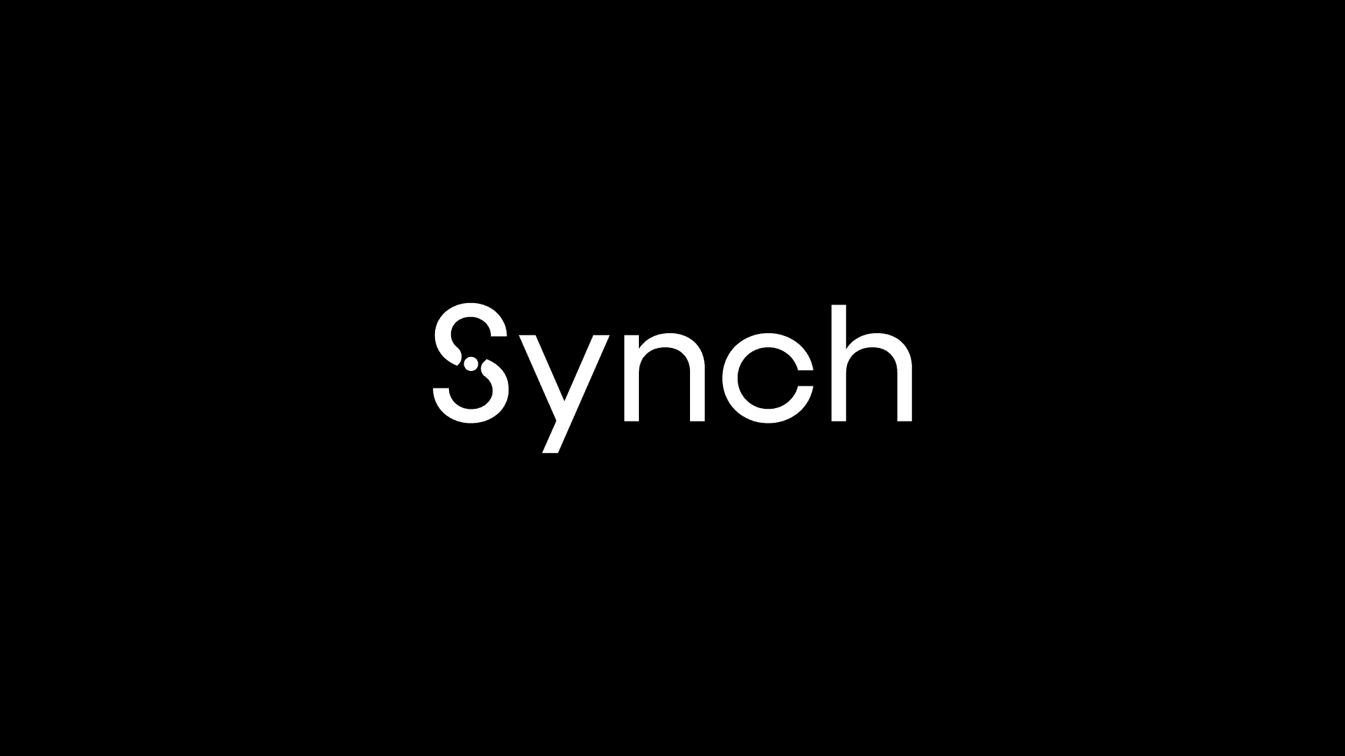
While stumbling onto the name of Synch. Piece by piece:
Cinch – an extremely easy task
Sync – two or more things working together properly
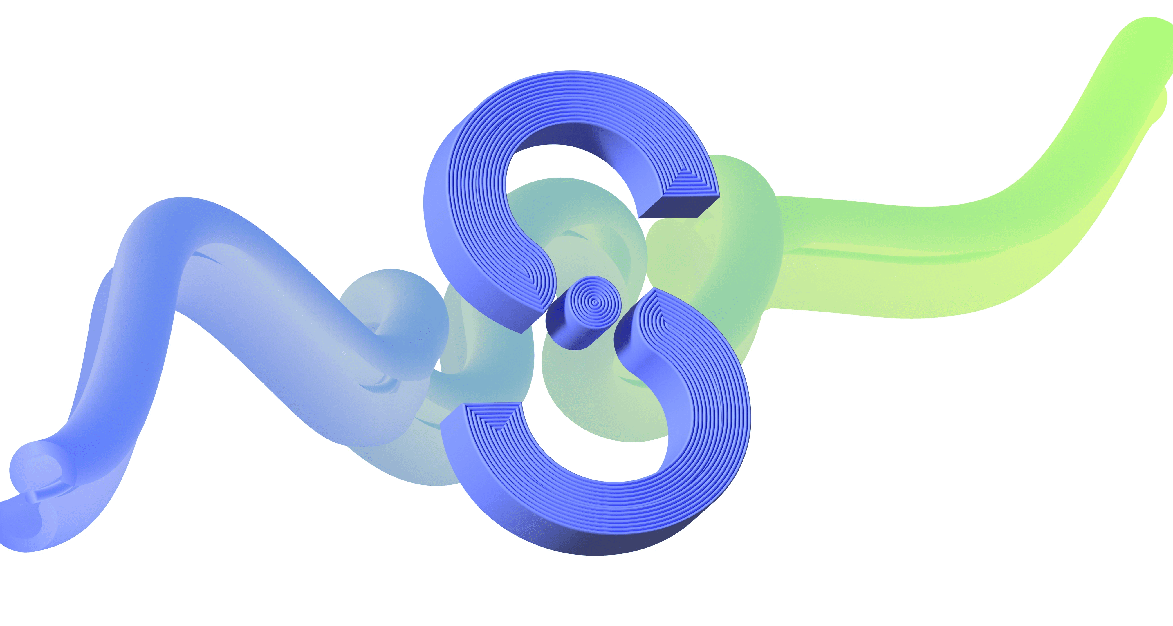
When I clash these words together I get a magical adaption of a word: Synch. An easy way of connecting financial solutions to businesses to work together. A quick illustrative example of how it looks when everything is working in tandem.
Type & Color
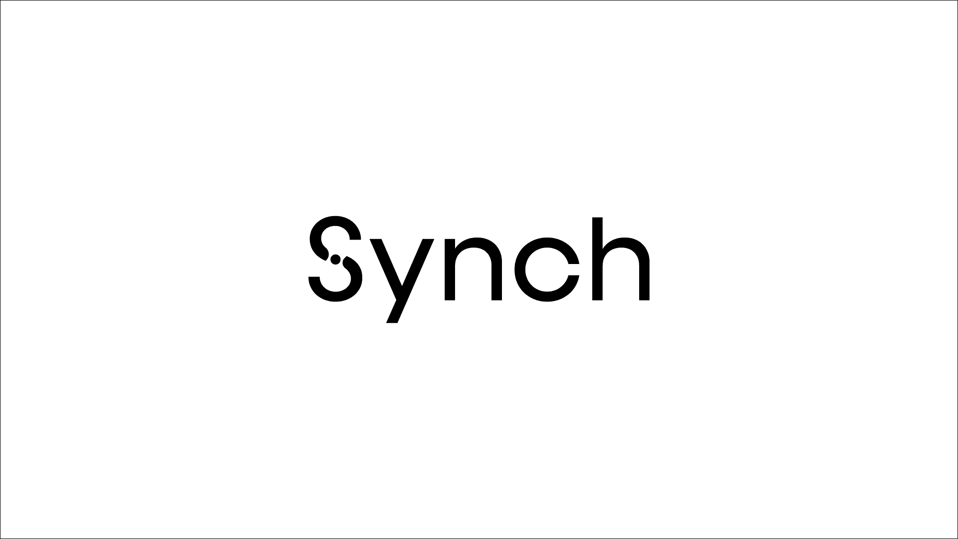
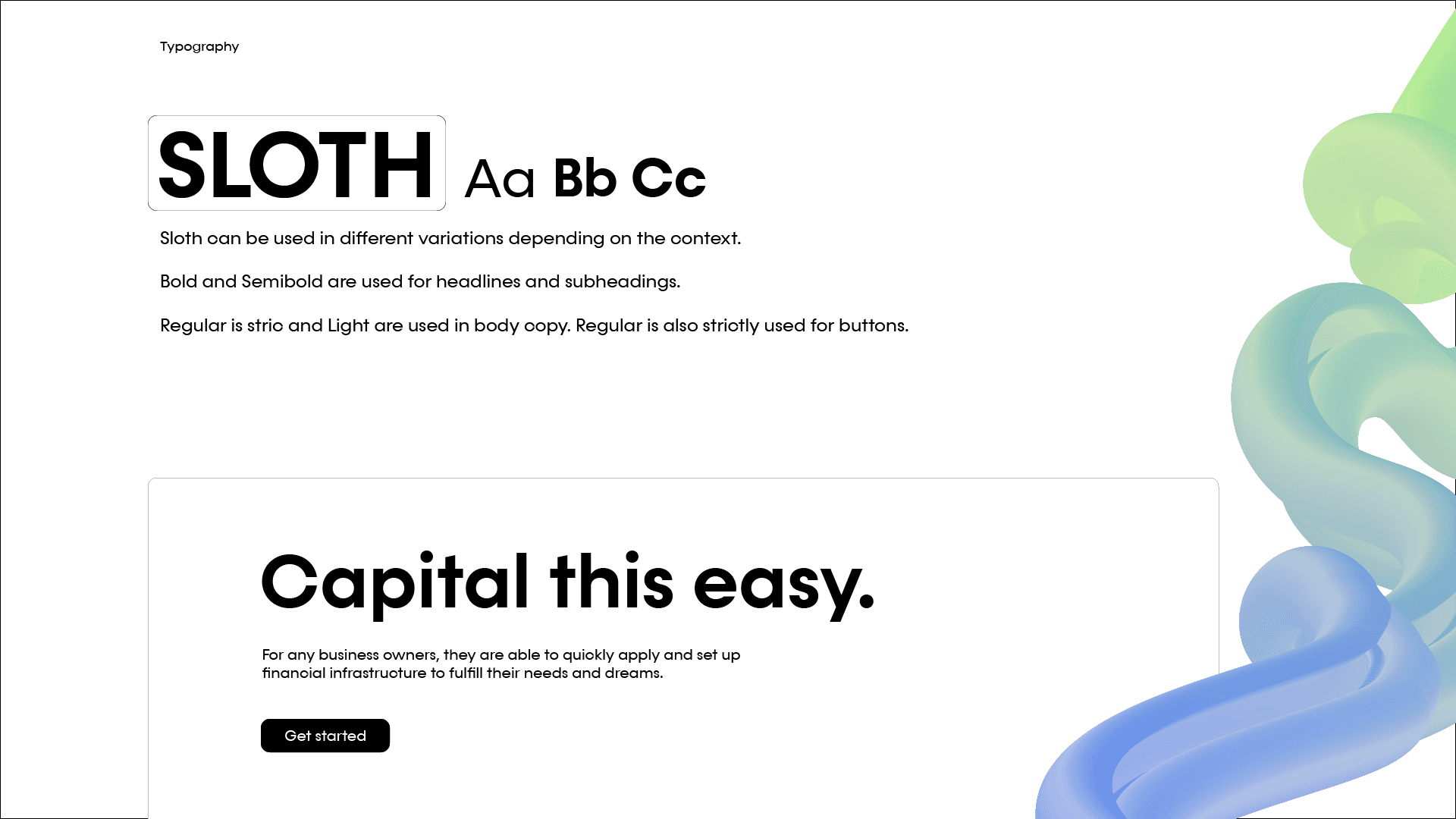
One font was chosen as the primary for the entire kit. Because Sloth has many different weights, and is a strong sans serif, it can be easily used across the entire product suite. It was a strong candidate to keep it clean and professional but have some character and gusto to it with it's blocky varieties.
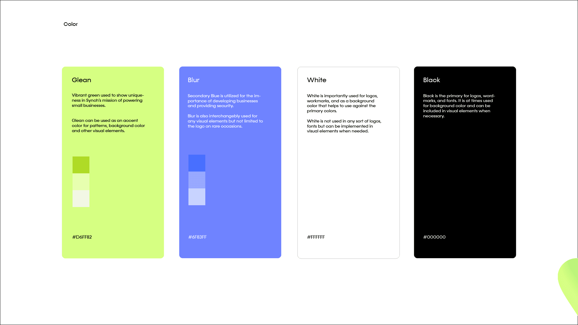
Colors were mentioned previously in the beginning, much inspiration came from this color palette where there's a very vibrant and electric yellow/green that feeds into the word empowering. Pair with a safe array of blue hues still gives it a comforting feeling of trusting this brand with your business needs.
Visual Elements
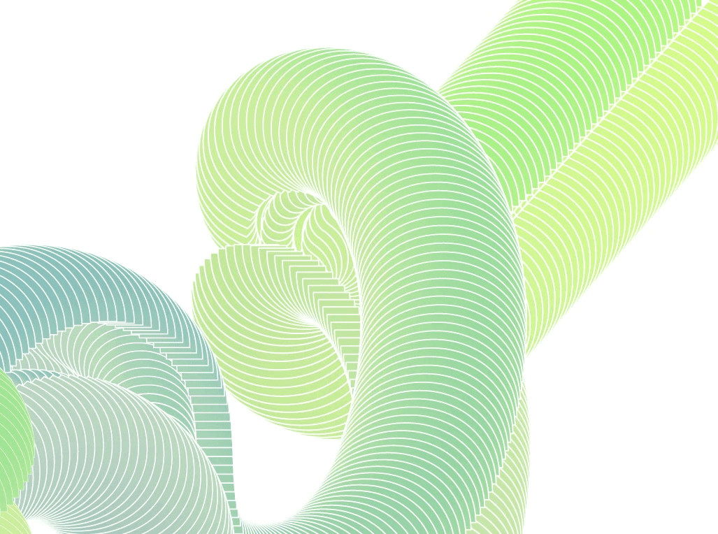
I wanted to explore 3D elements within the brand and keep it in line with what it means to be connecting solutions to businesses.
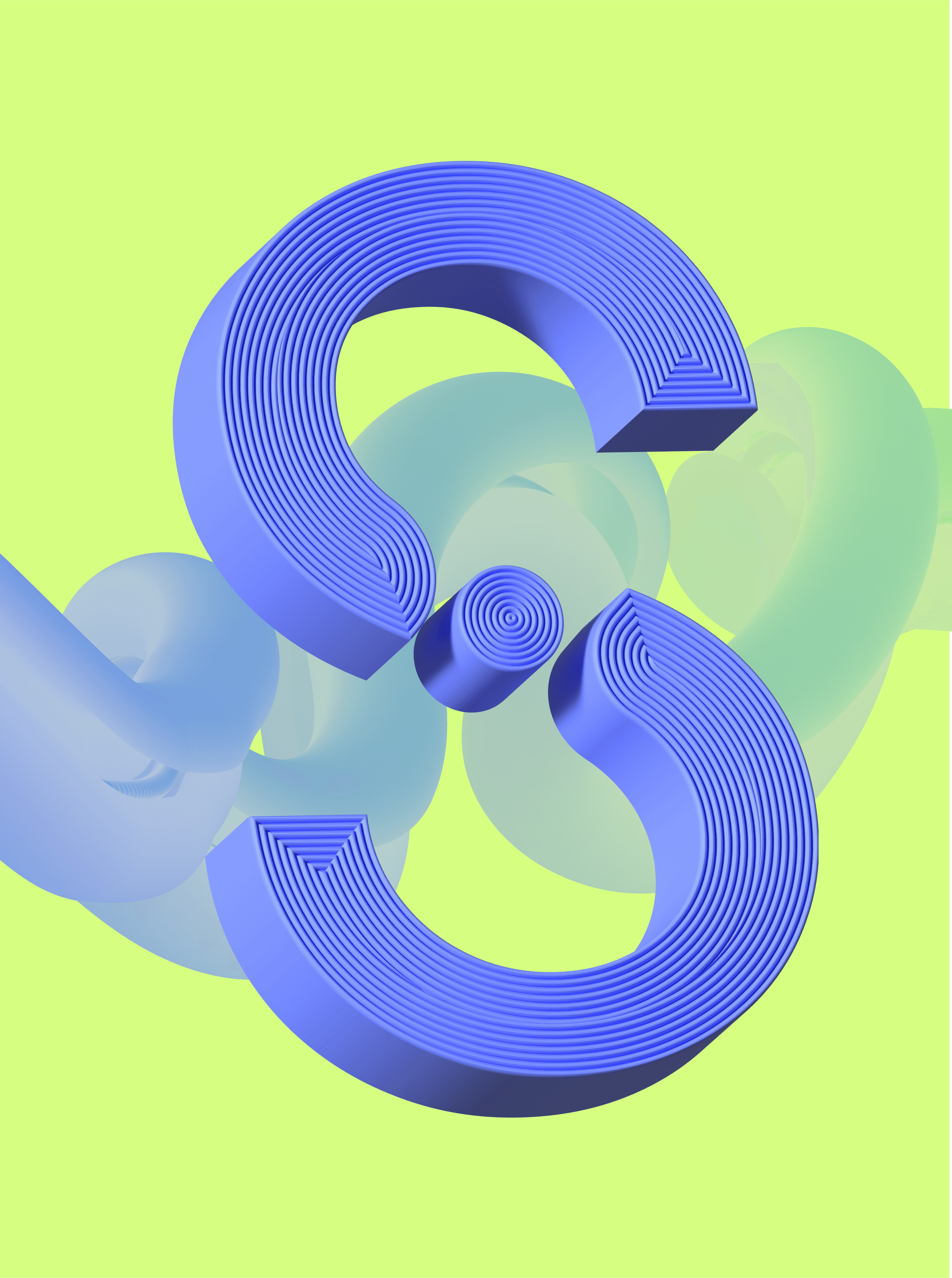
Pulling out the flowing abstract "S" logo in the background felt like a strong way of visualizing a connection.
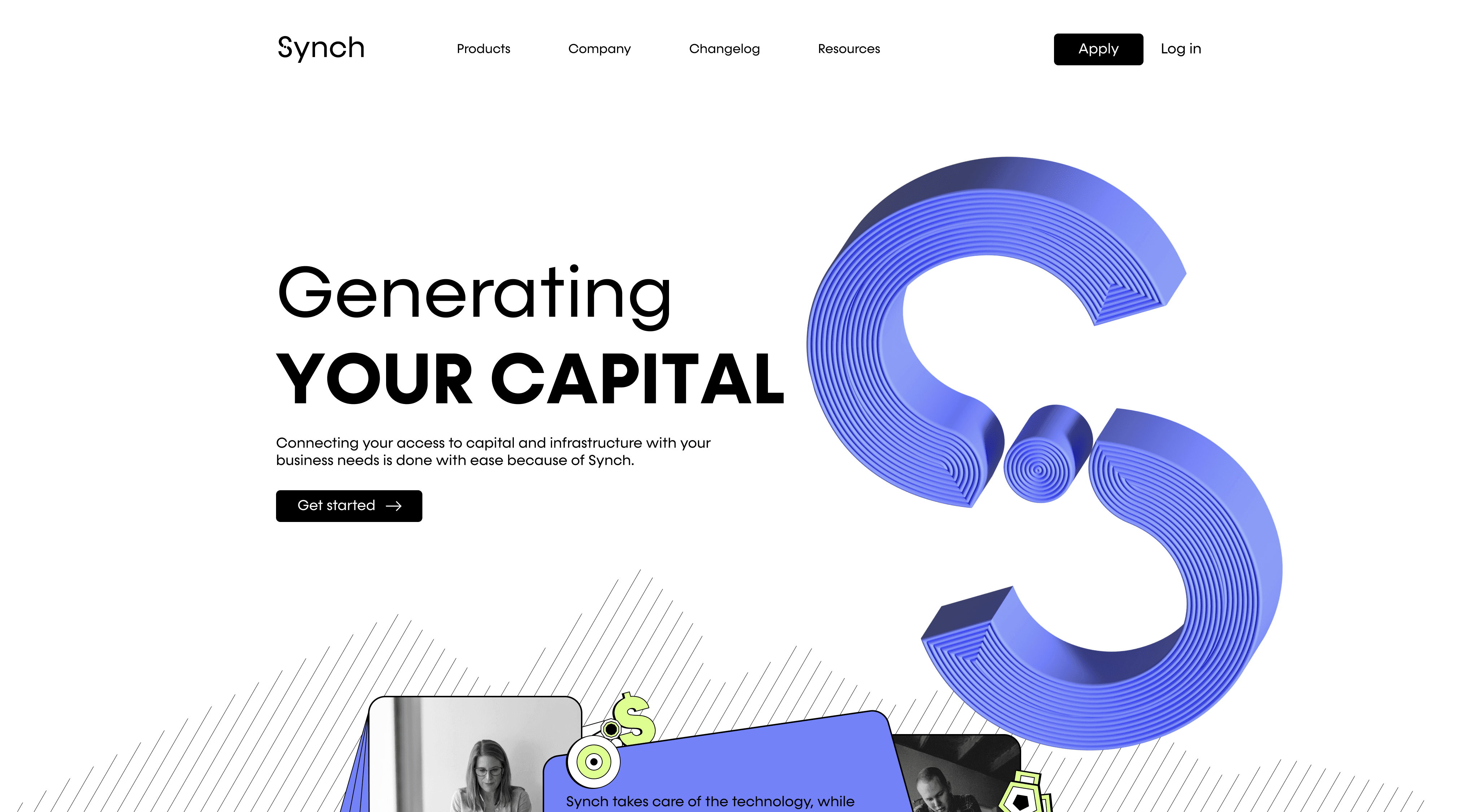
Along with making the textured "S" logo, which played an important part for the creation of the landing page as it feels like a unique asset.
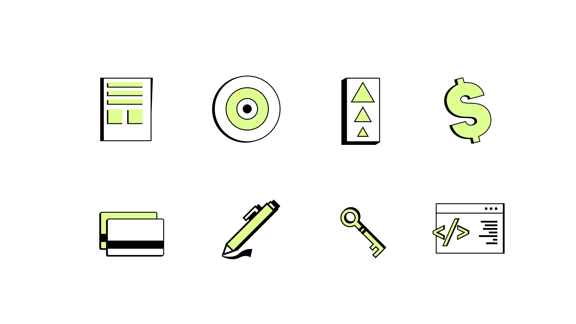
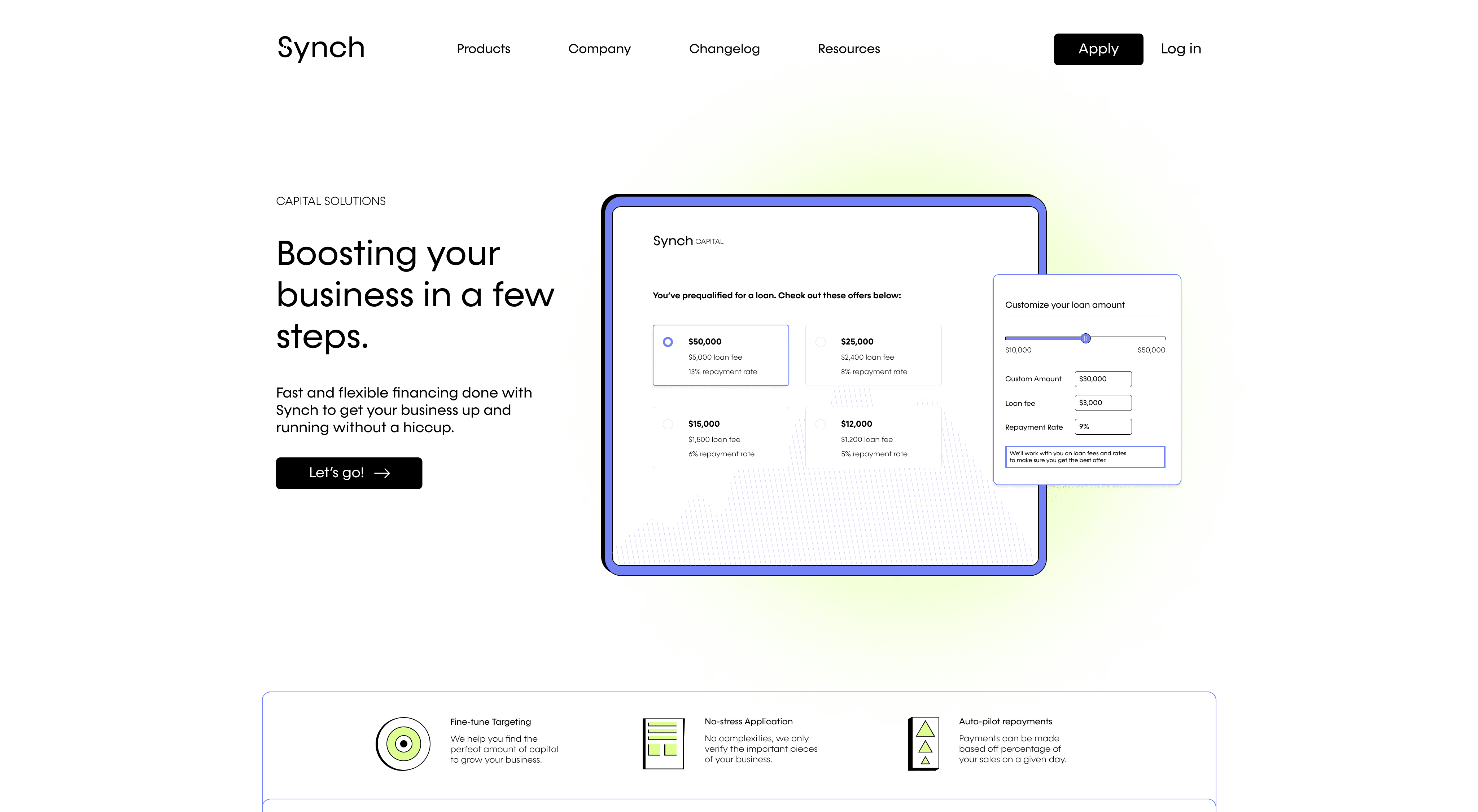
Other visual elements were iconography which can serve as a useful way to visualize product features, solutions, and ease that Synch offers. A small library was developed to make those visualizations.
Outcome
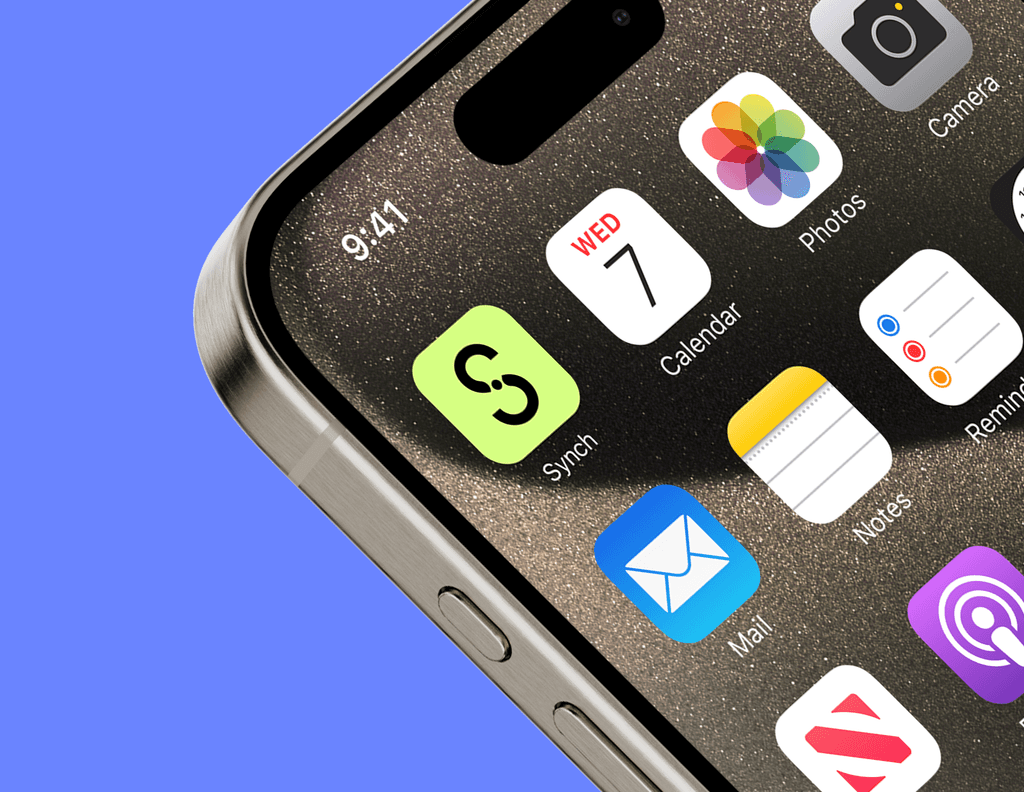
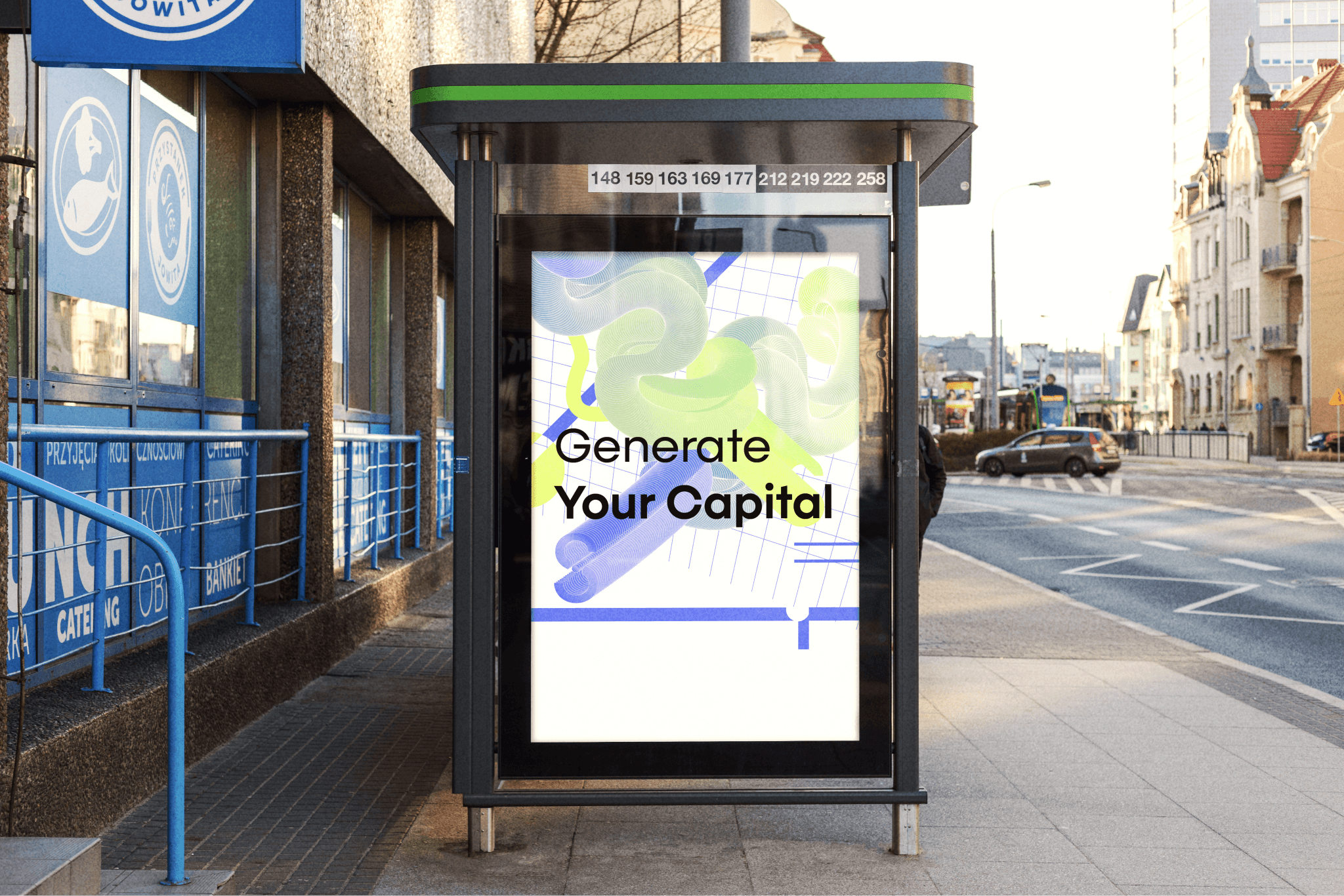
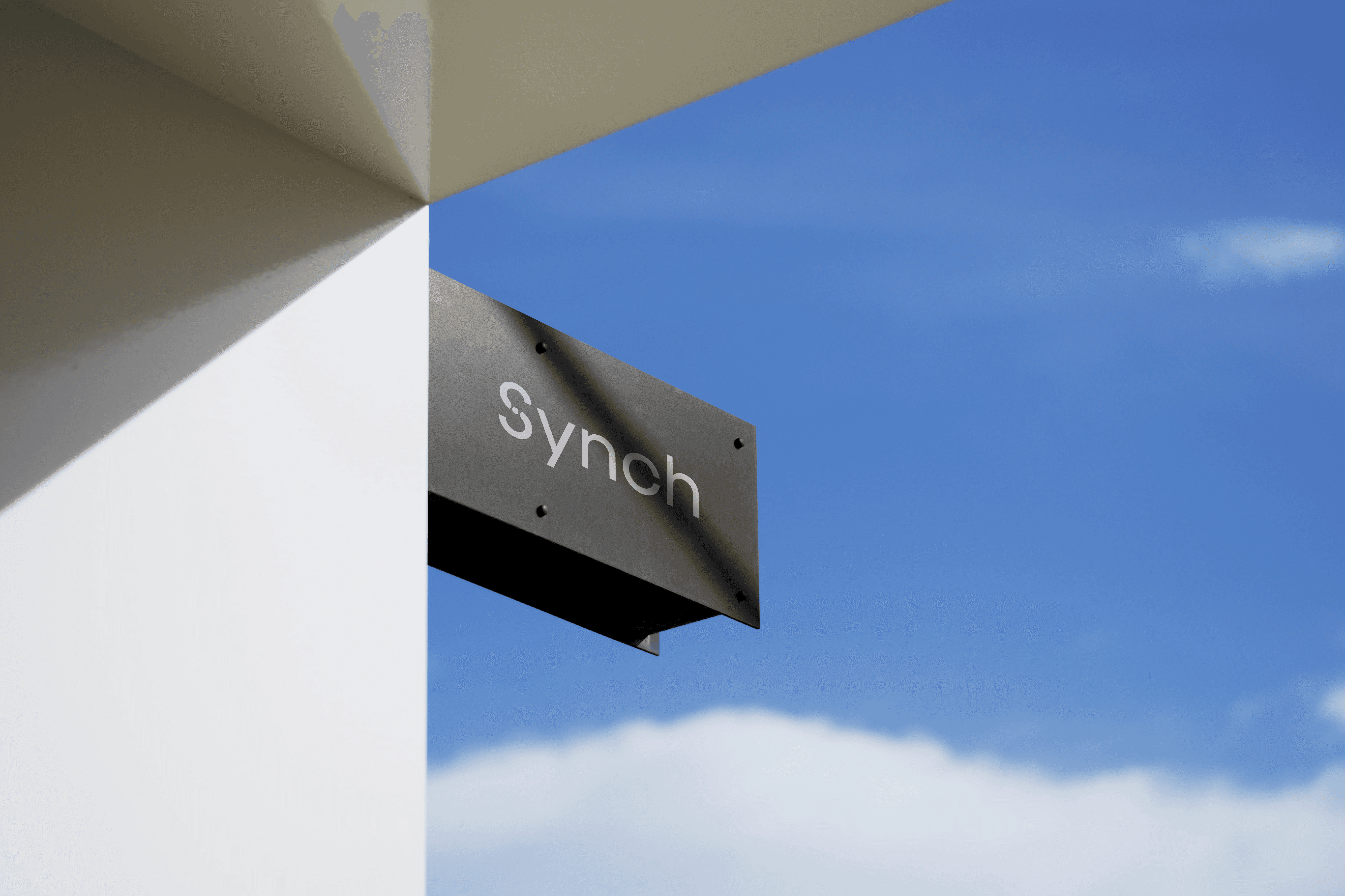
The purpose for this project was focusing on crafting a fintech company's brand and art style. Within this, it was important to find a way to make the initial design process, and company ideology cohesive and intentional. Along with this, it was a great way to explore 3D visuals and practice on my iconography. Both visual elements can have an impact when exploring brand motifs, or experimentations that could be useful in a designer's skillset.
Being a designer that wants to stay within tech, I thought it important to try a project that felt more tech focused than other branding projects before. It can be difficult to apply constraints, but it's more necessary to understand the business needs, goals, metrics, etc. to be able to understand what areas feel the most appropriate and opportunistic when working on brand and visuals.