Monsoon – (Updating)
Scope
Visual Identity
Photography
Art Direction
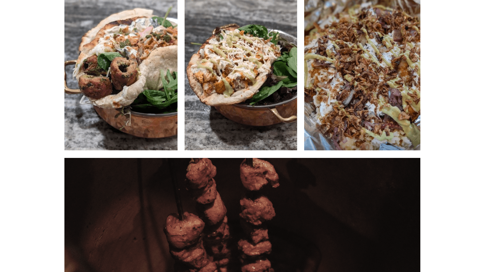
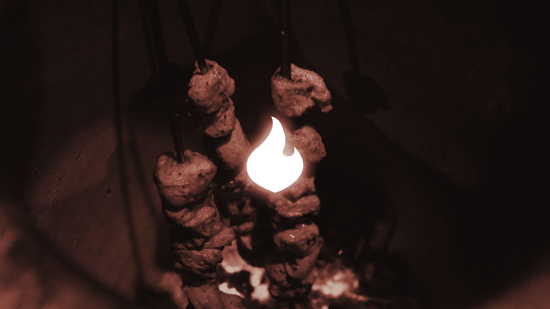
A local food pop-up started by two South Asian Americans. Using a tandoor oven, they bring cuisines from Punjab and Gujarat flavored with all kinds of spices and real spice itself.
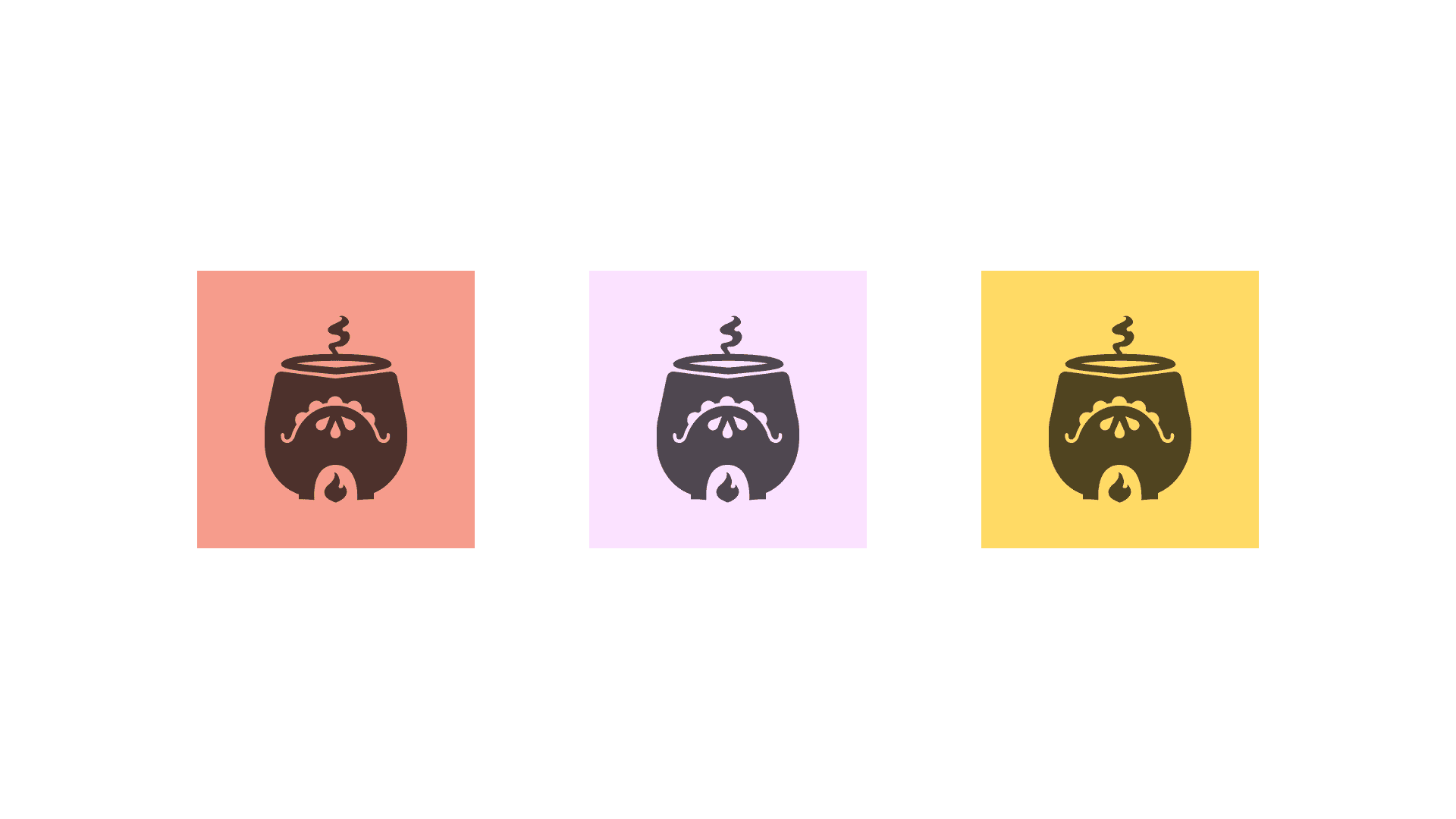
The brand came together by trying to bring a fresh but traditional look — this is accomplished using a distinct logo, explosive colors, and visual elements that can be a flexible library of expressions. One of my first client projects that I can confident be proud of in my journey.
Typography & Color
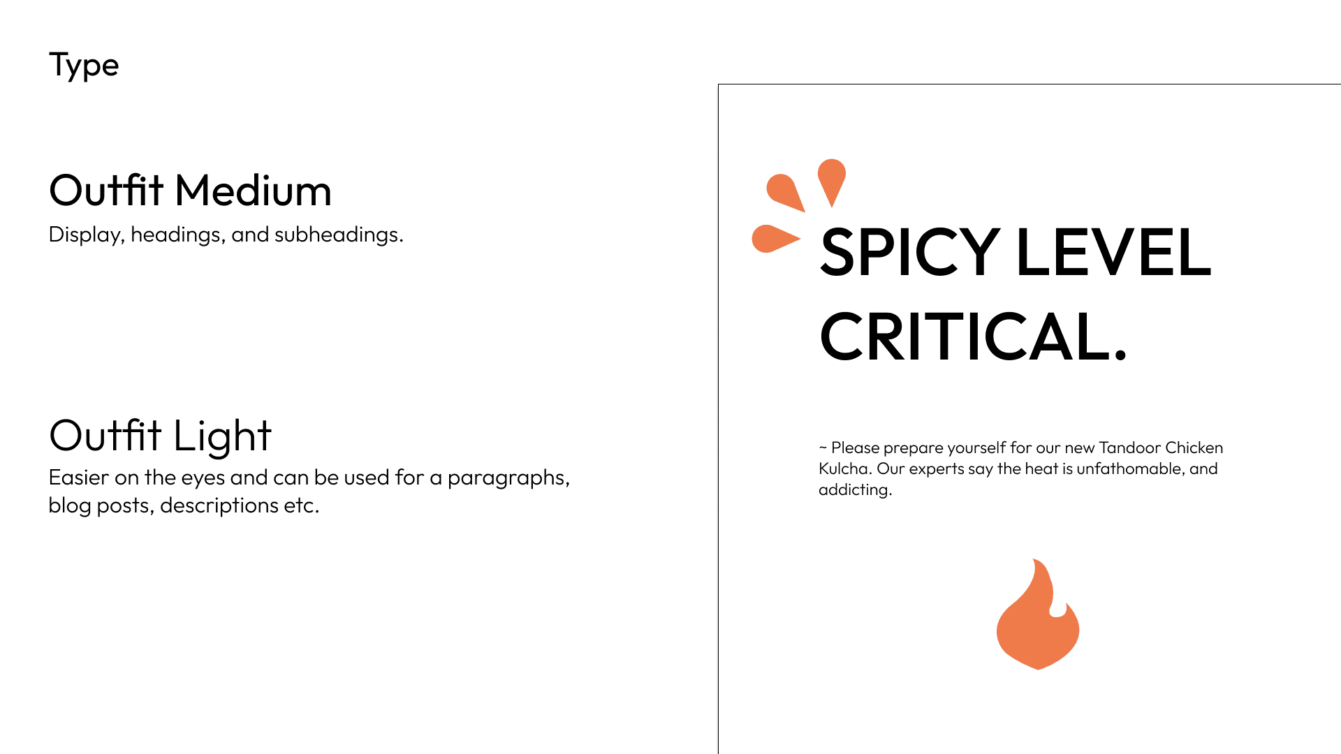
Bold and confident type, no need for anything special when the flavors and ingredients provide the complexities. Here we use a simple sans as display with a varied light as supporting for any paragraphs, in-texts, blogs, etc.
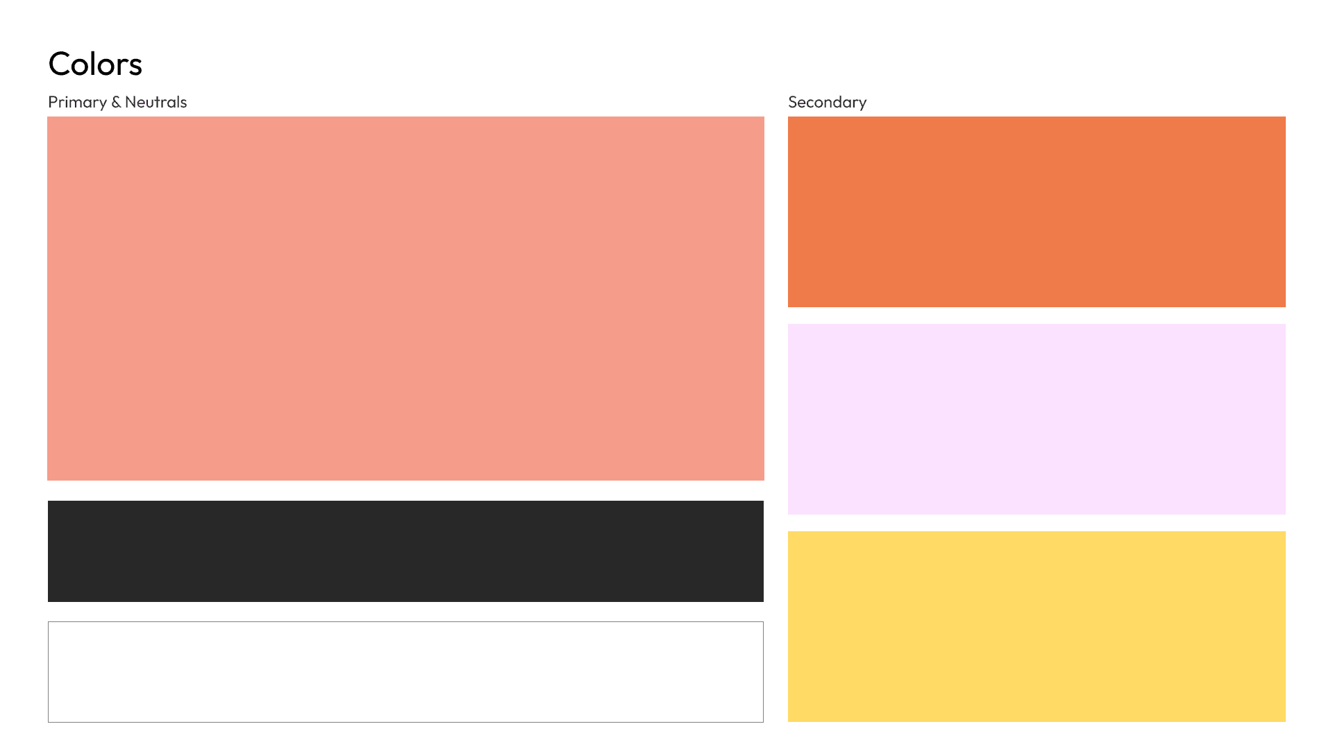
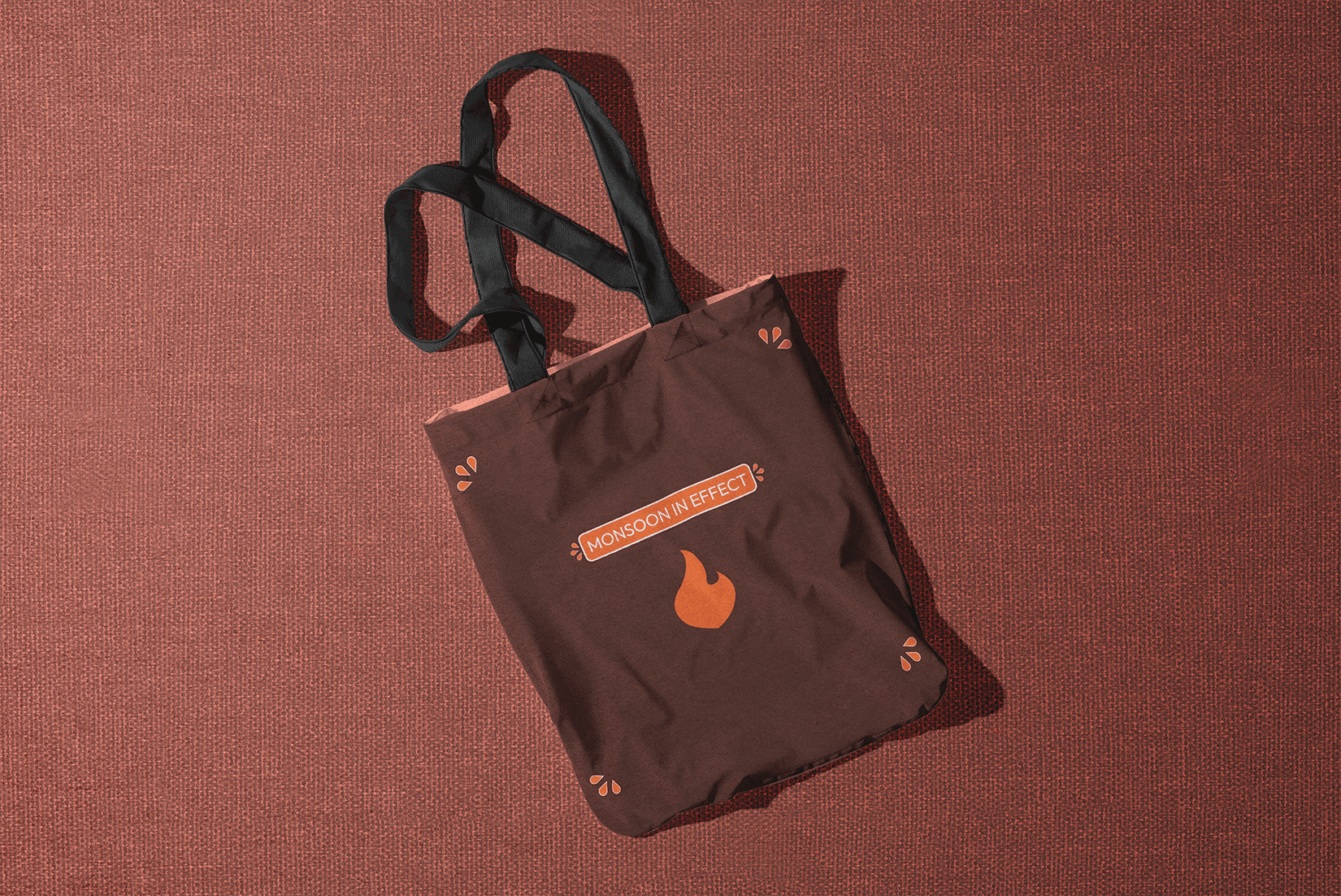
Color is meant to pop, and be subtle with finesse. While the bright orange serves as a primary, the secondary colors can often be utilized for any branding/promotional work on social media and website content.
Photography
Visual Language
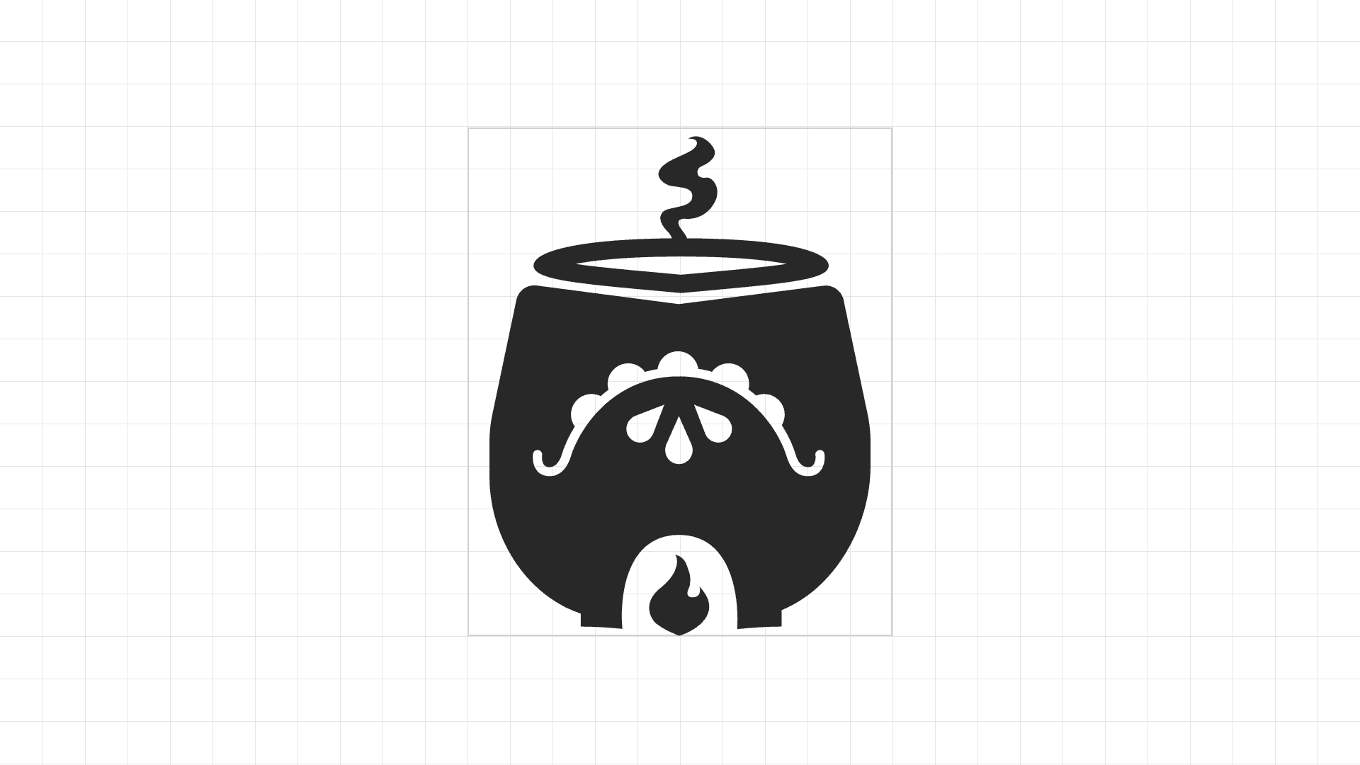
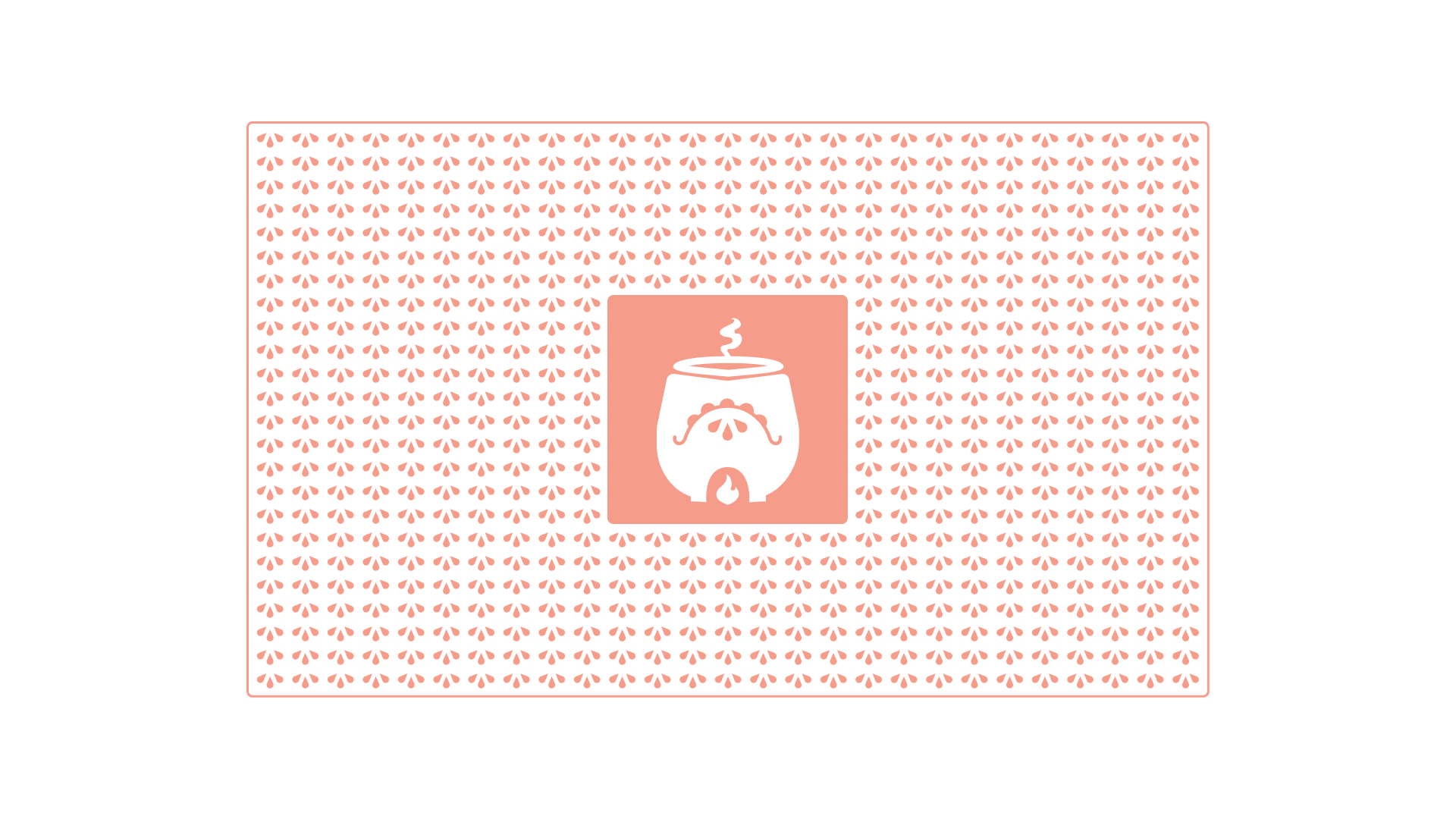
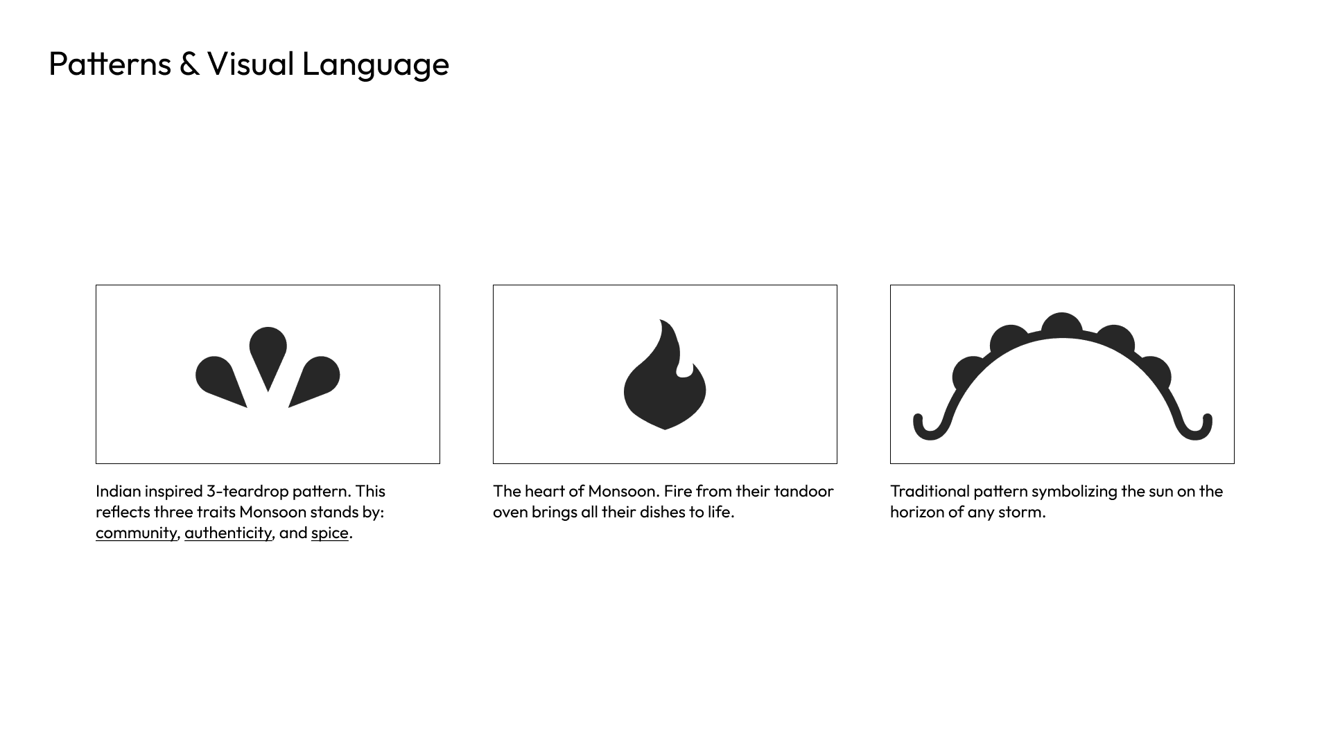
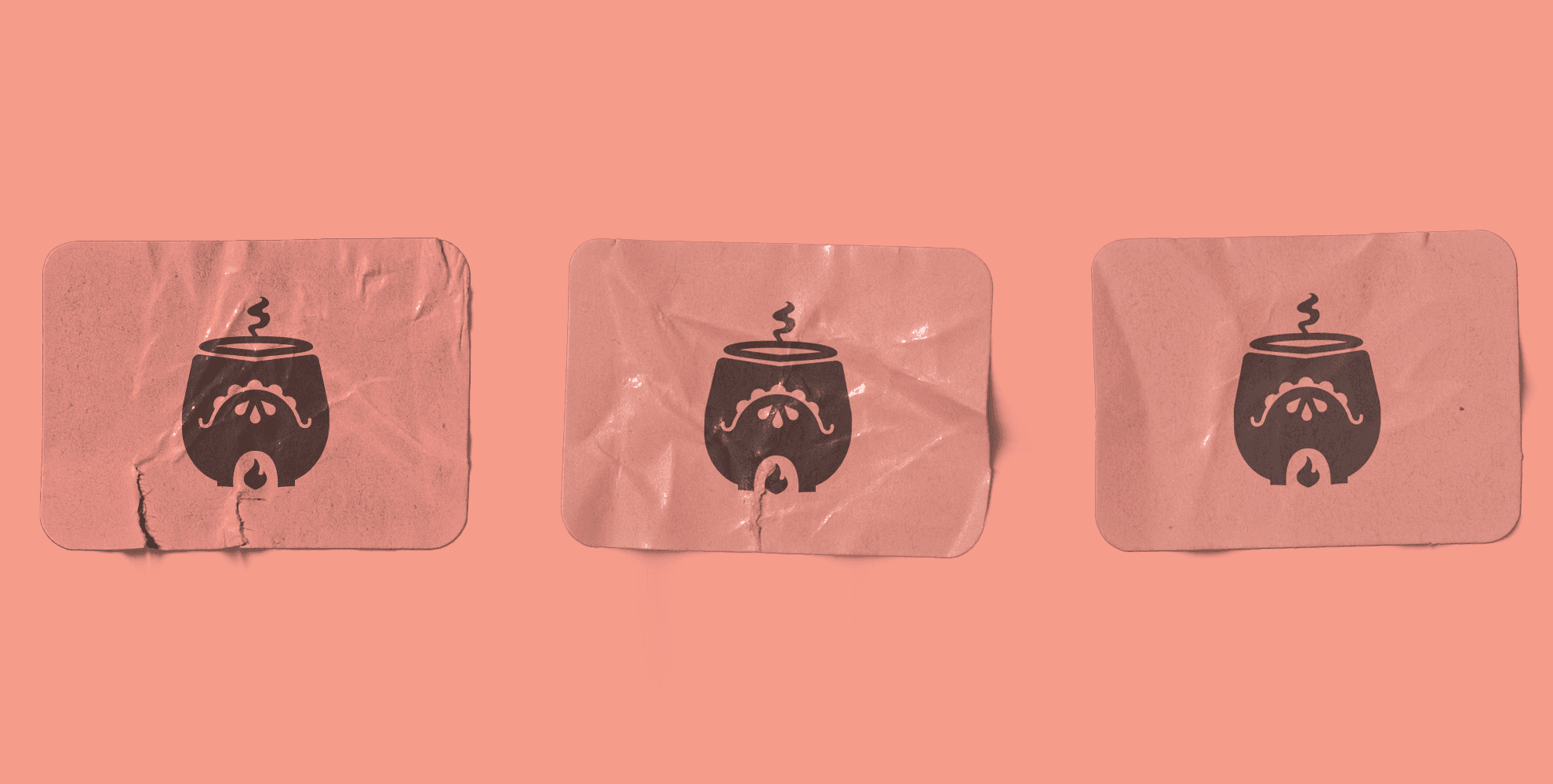
The logo utilizes all of these elements of the brand as defined below. Each element can be used in a pattern across different mediums and a set of patterns was given to the clients for use as needed. They all convey a meaning towards the brand and characteristics these owners share for their passion.
Branding
