7AM Running Club
Scope
Visual Identity
Logo
Web Design
Art Direction
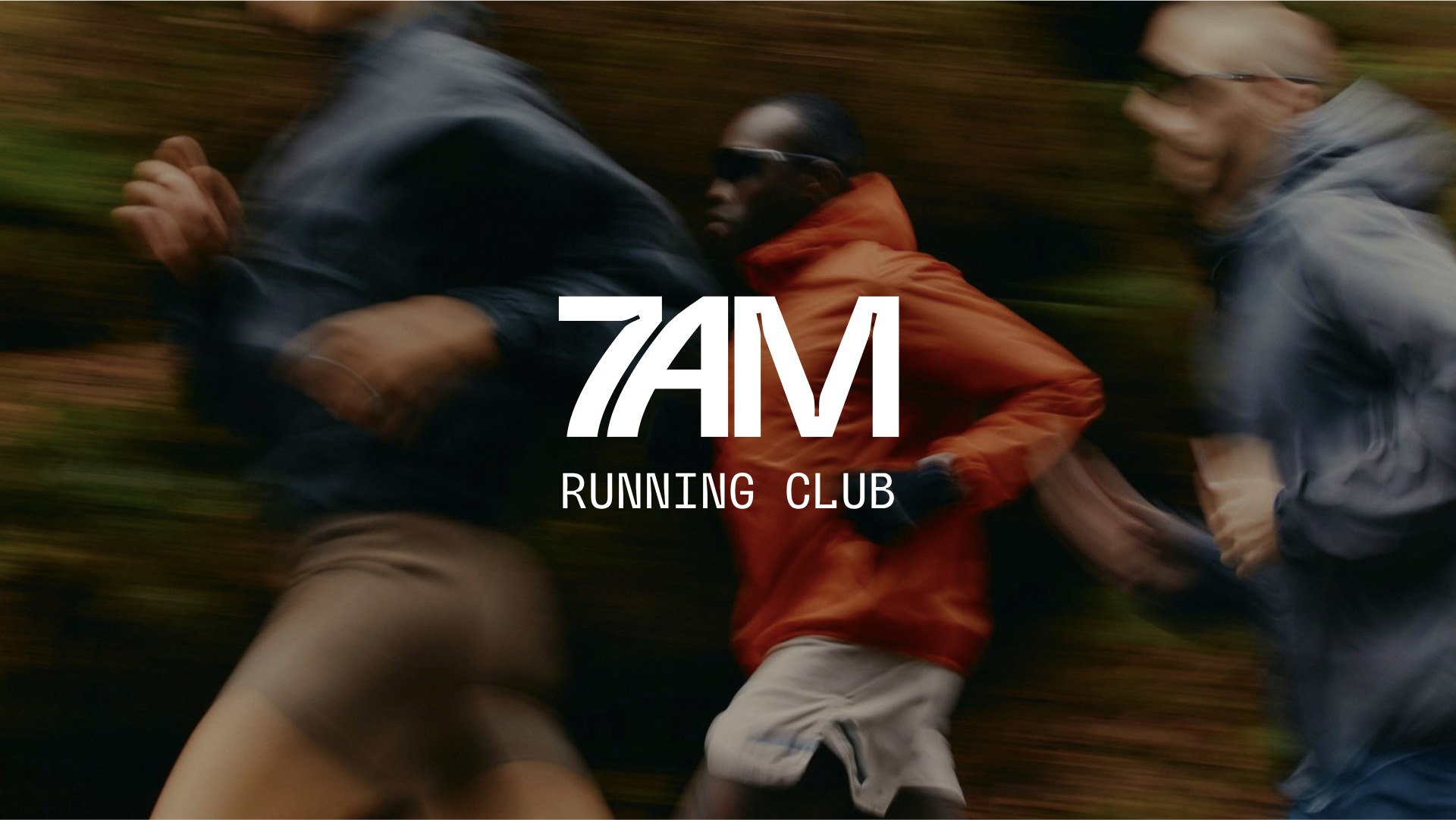
7AM Running Club is a trail running community nationwide. The club aims to put together trail runs and hikes for all to join, promoting togetherness, wellness, and reaching goals. To extend even further, this brand hopes to create an identity known to athletes; not professional but everyday athletes.
I designed the visual identity that pulls in the tangible feeling of three words: community, growth, & nature. The elements communicate these feelings to runners and hopes to inspire those aiming for goals.
Logo
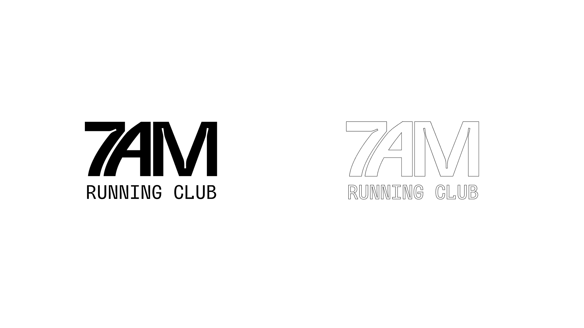
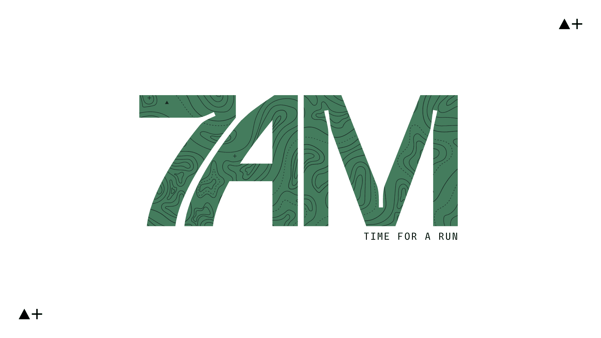
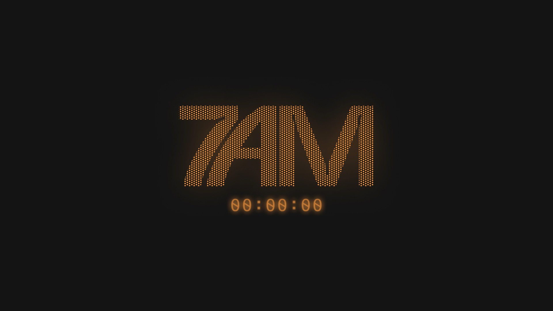
The idea of this logo came from exploring different typefaces that had strong characteristics, unique features, and movement. It was created by manipulating the typeface, Trap. The kerning was brought in closer and the shape of the A was adjusted to achieve more flow and feel intentional.
Color
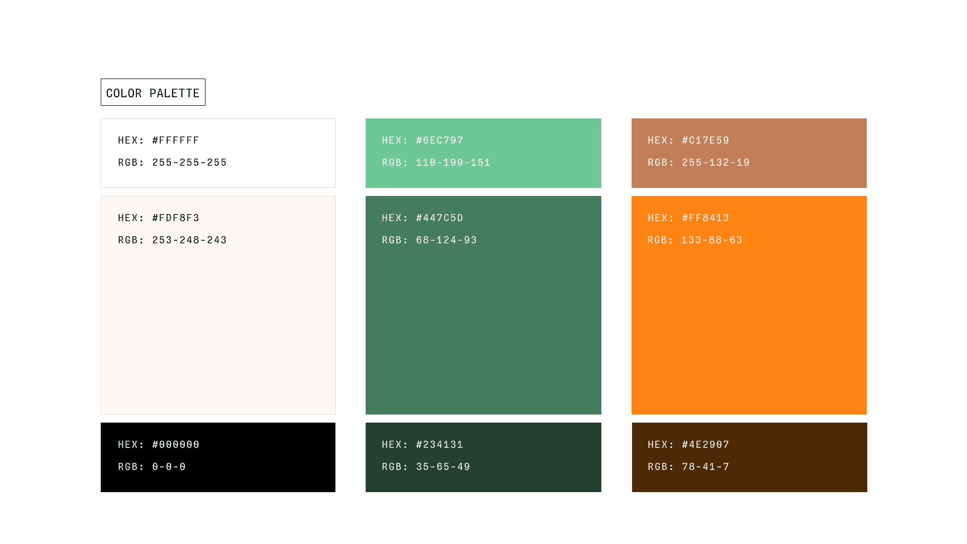
In essence, this brand revolves around running, exploring, and the outdoors. Color is used here to tie back to nature, earth; natural with those greens and browns to keep a consistent motif, while I utilize brighter colors like orange and light green symbolizing energy, personal growth and development.
Neutral colors are important here to balance between those earth tones and energetic colors so that there's a stark contrast when designing assets, websites, etc.
Typography
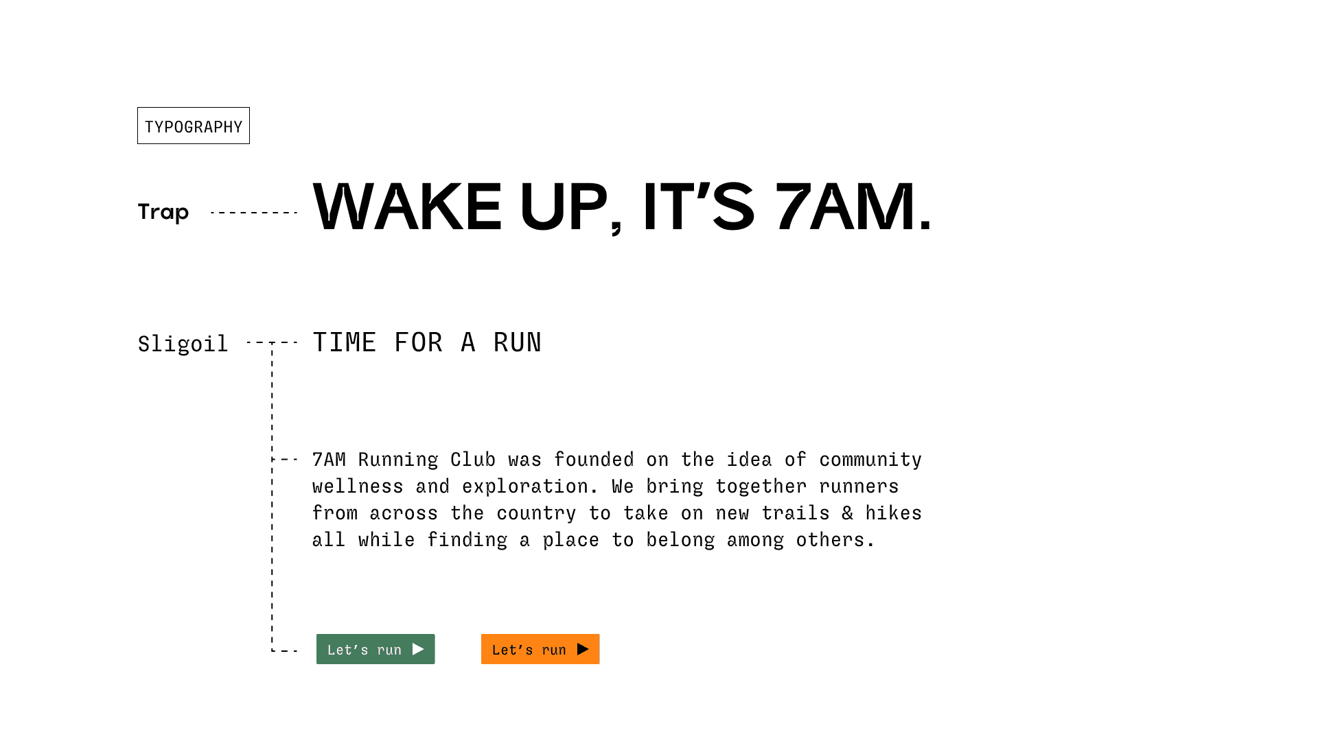
Trap is the display typography and has a bold and strong typeface that accompanies the energy meant for a running club, as well as it's uniqueness with notches in the lettering that gives it a distinct look.
Main font, Sligoil Micro, is an interesting typeface that resembles a bit of retro-ness which gave me inspiration with that of a stopwatch or timer that runners use or ones seen in marathons.
Patterns
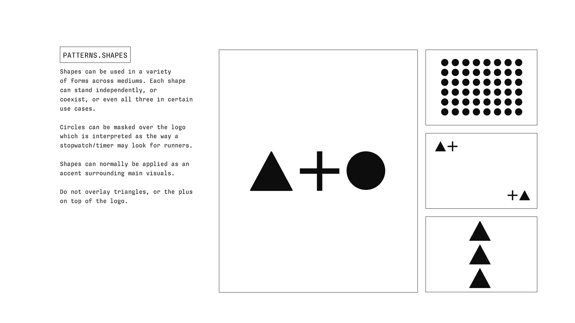
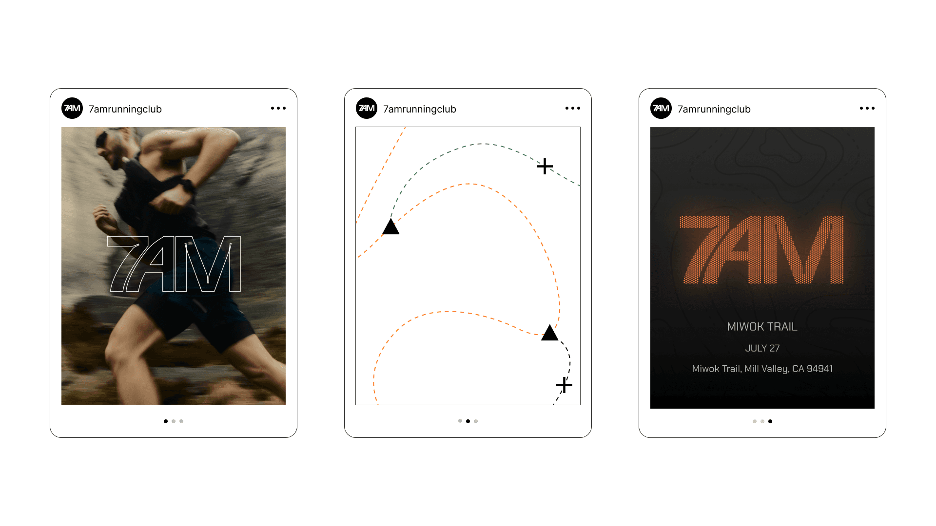
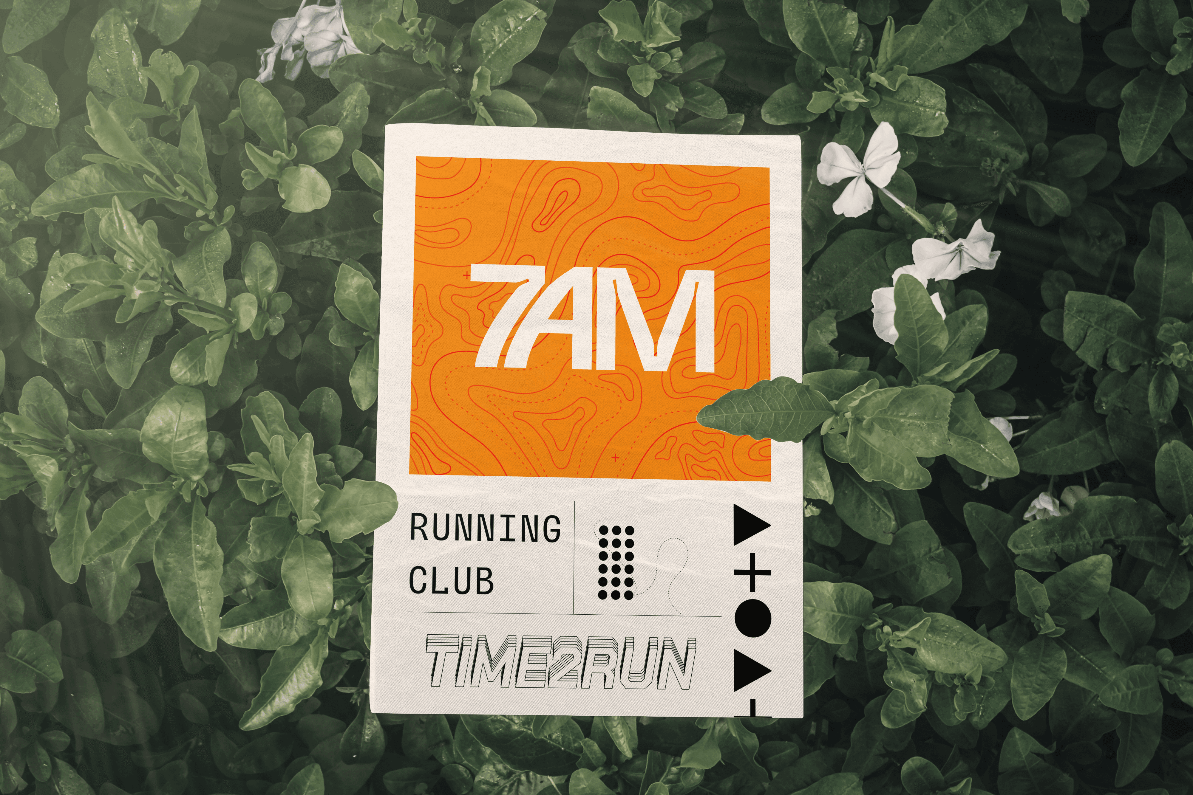
Three distinct shapes are rooted in the characteristics of the brand: growth, nature, and community. The symbols all loop back to topographic/trail maps as well. Within topographic maps, these symbols or variations of them can represent a few different things. For example, the triangle symbol is a peak marker on a topographic map.
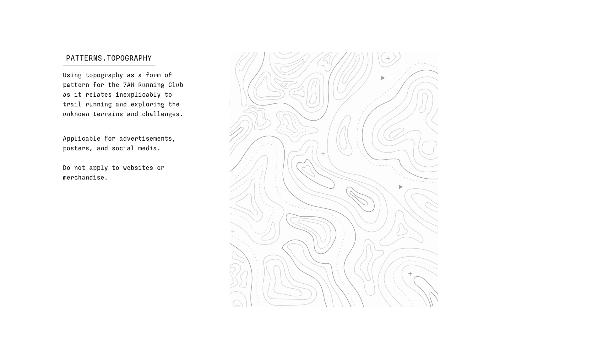
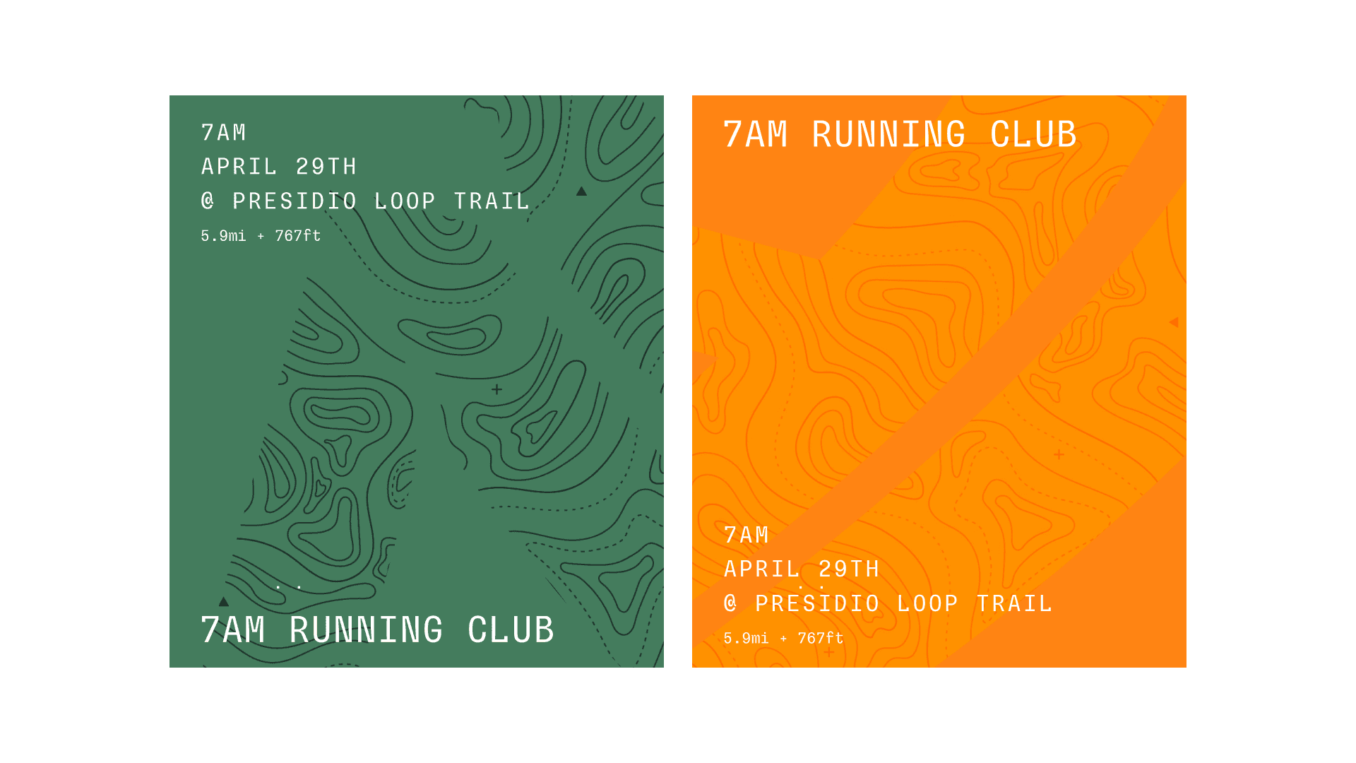
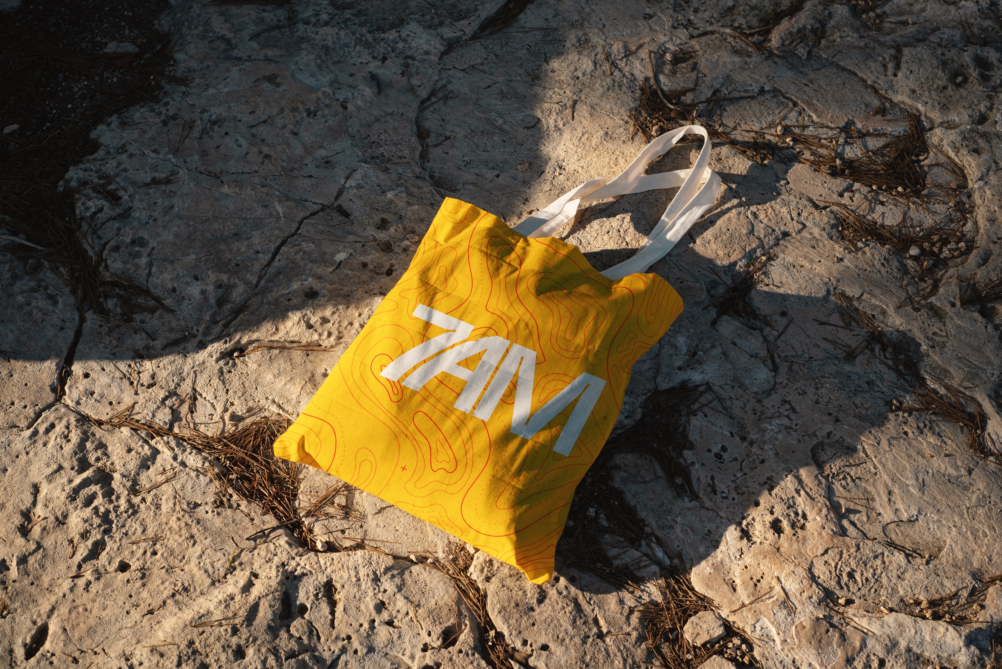
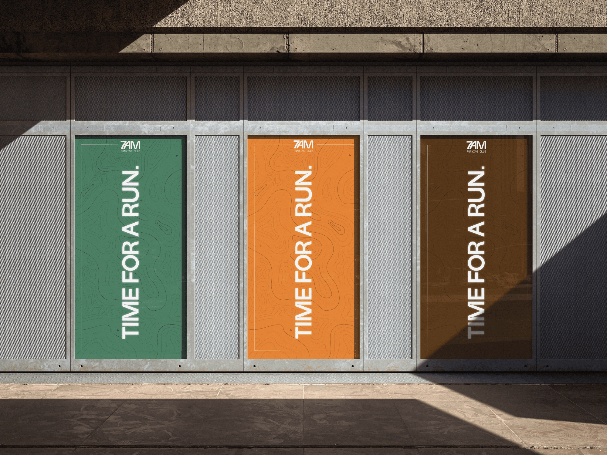
Secondary visual is a topographic texture/background that is self-explanatory in that terrain is ever-important when it comes to trail running, but it can serve as a background or mask for many pieces of the brand such as marketing, social media, websites, posters, etc.
Elements At Work
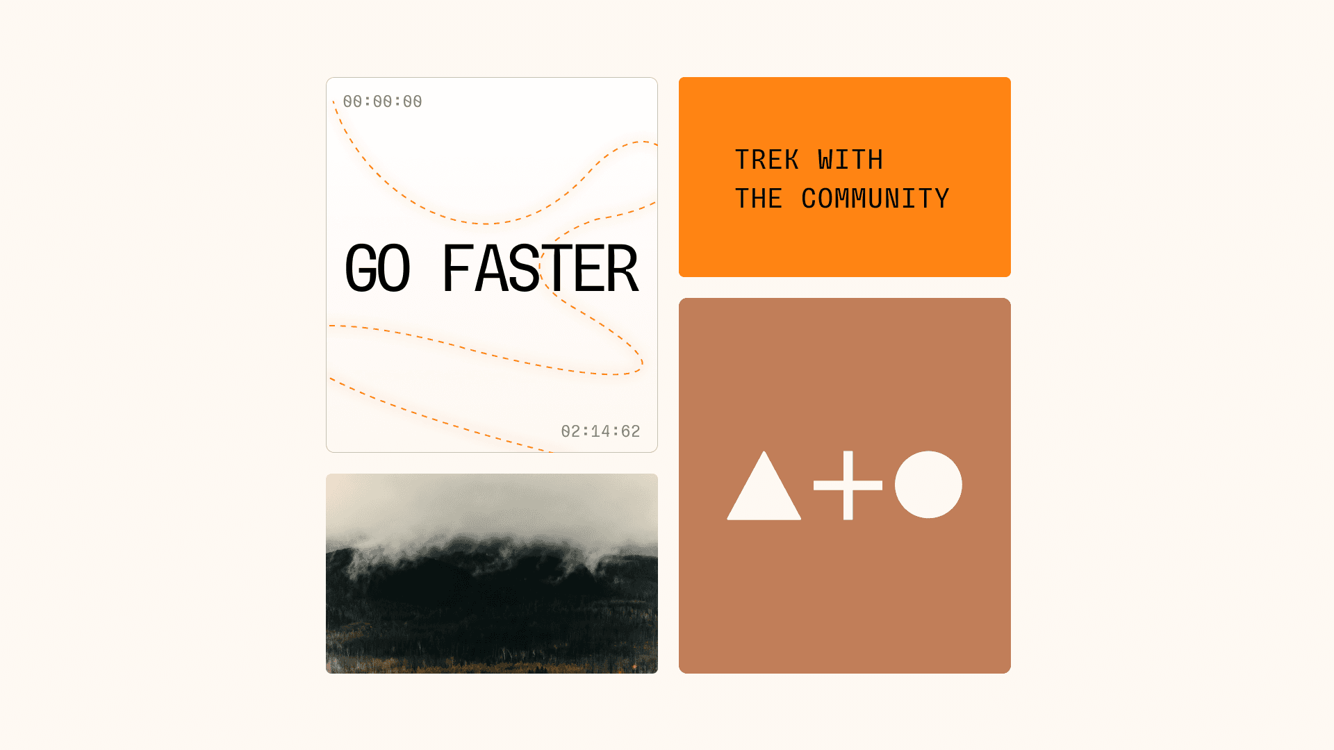
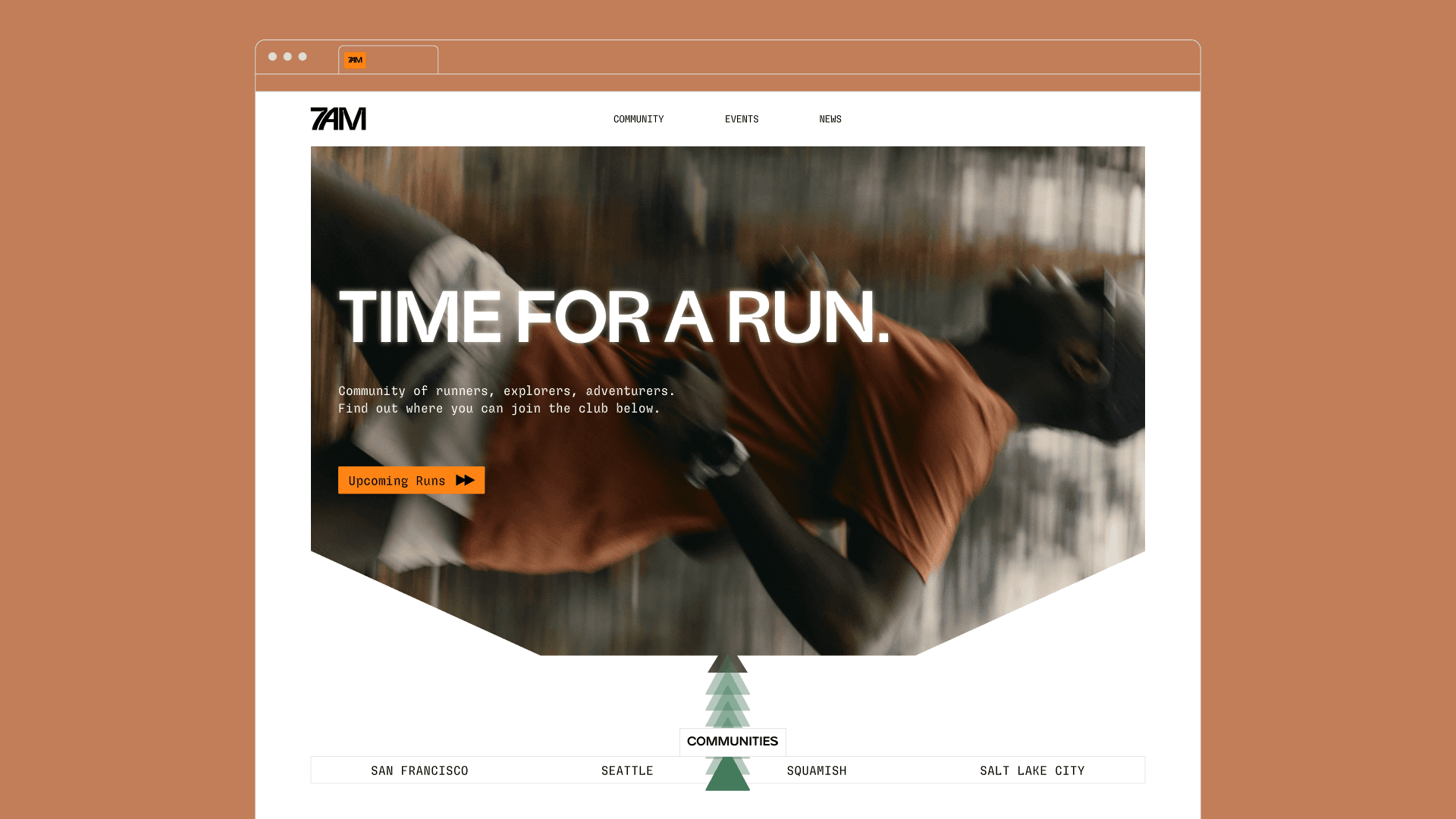
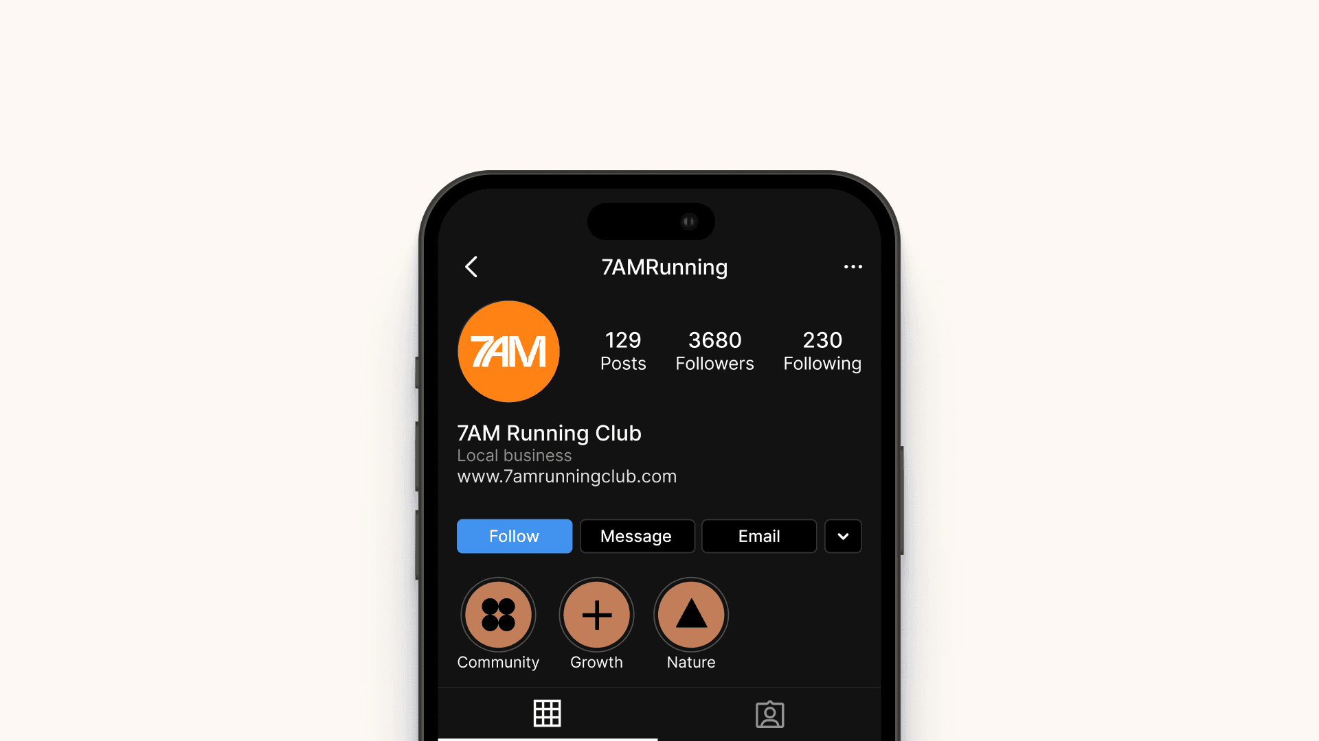
Assets can be produced using imagery and elements that create that essence of trail running. Whether its a piece of the topographic map standing in the background of a poster, or the simplicity of the three shapes that are the core of the brand. It becomes easier when there's a defined library of graphics.
This was part of my goal with the project – being able to bring together a consistent set of branding and graphics that doesn't feel disjointed to the audience.
Outcome
As a more recent branding project of mine, I wanted to explore ways to be consistent with my visual elements and themes. Having that consistency across all pieces makes for a stronger brand and efficient message geared towards the right audience. It was something that I previously struggled with, but taking my time with this project and receiving feedback from experienced designers was a great way to gain more depth on my design thinking, and truly reiterate with intention rather than assuming something feels off.
When you feel like designs are consistent across the board, the idea becomes a little bit easier to form and deliver to your target audience. It can become second nature when thinking of what designs can be explored, but that also comes with the same difficult constraints of coloring inside the lines.